But unfortunately such a standard is not yet in place, and monitors vary wildly in their response. The user has some, but not total, control over it. He can adjust the monitor to better or worse performance. But most people intentionally misadjust their monitors! And there is good reason for it: Text is most readable when the contrast is as high as possible. So people tend to adjust the contrast very high, the brightness rather low, and that gives easily readable text. But it also gives terrible quality when viewing photos, as all the darker tones are turned into pure black! On the other hand, if a monitor is adjusted for reasonably smooth response over the entire contrast range, a text shown on white background is glaring, blasting, and not at all comfortable to read!
It would be great if programmers finally did away with white backgrounds, so that people could use the same (correct) monitor settings for both text and photos.
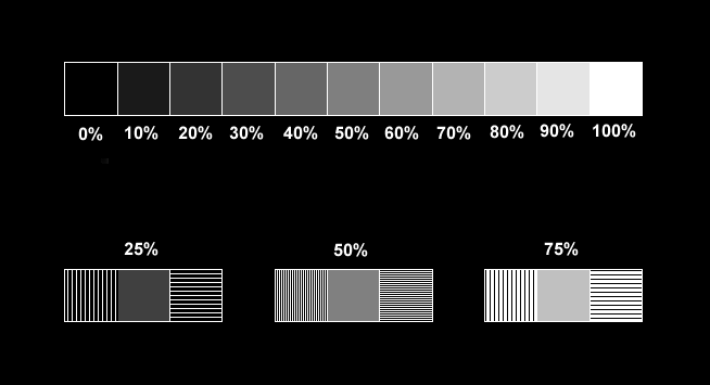
I have prepared a little test chart to check basic performance of a monitor, and to aid in properly adjusting it. The top row consists of 11 squares that are filled with different gray intensity levels, from full black to full white. The basic brightness and contrast controls of the monitor should be set such that the following conditions are met:
- The 0% square is perfectly black. It should emit no light at all. You can check this with a loupe, or with a cardboard having a hole cut into it.
- The 100% square should be fully, bright white, just as intense as possible without producing glare effects.
- Each of the squares should look clearly different from all others. Some monitors are internally misadjusted so that the 10% and even the 20% squares appear totally black, regardless of what you do with the external controls. In these cases, it's necessary to open the monitor and adjust the internal "screen" control, or eventually the color bias controls if there are any.
- All squares should be pure black/gray/white, with no trace of any
color. Compare them to a gray object held near the monitor. Of course,
the color of ambient light influences the color perception, so you may
want to prepare two settings for your monitor, if it allows that: One for
daylight and one for artificial light.
If there is an overall color tint in the squares, it can usually be
corrected with the color temperature settings of the monitor. If there
is a variable tint at the different gray levels, internal adjustments need
to be set. A color tint in the darker squares is corrected with the individual
color bias settings, while a tint in the brighter squares is corrected
with the color gain adjustments.
Now let's advance to the lower groups. The center square of each is filled with gray at the brightness percentages stated. The side squares are filled with black and white lines of varying widths, representing the same theoretical average brightness as the grays square between them. The left squares of each group have vertical lines, the right ones have horizontal lines. With these groups, you should check the following:
- Partially closing your eyes, or looking from far away, so that the lines melt into diffuse areas, compare the brightness of the squares in each group. All three squares in each group should have the same brightness. Most monitors will miserably fail this test! It shows monitor gamma, which is the linearity between the digital color value and the actual light level produced. Most monitors have a gamma far away from unity, and few monitors allow the user to adjust gamma. There are programs to adjust gamma at the video card, but these work only in some software and tend to be a mess.
- Using the same defocus techniques of above, compare the left and right
squares of each group, and specially of the 50% group, which has the thinnest
lines. If they are of the same brightness, the dynamic response of the
video amplifiers is symmetrical. If the left squares look brighter than
the right ones, your video amps have a faster rise time than fall time,
and conversely, if the left squares are darker than the right ones, the
rise time is slower than the fall time. How does this work? Simple: The
picture tube is scanned in horizontal lines. The right squares with their
horizontal lines allow the video amps to settle at the white and black
levels and stay there for the duration of many pixels being scanned. The
left squares instead, with their vertical lines, force the video amps to
go fully from black to white, very quickly - in the 50% squares actually
they ask for the monitor's maximum video frequency and amplitude.
Note that liquid crystal displays (LCDs) are free of this problem,
since they are not scanned in lines.
- In the 50% group, compare the left and right squares for sharpness.
Both should be equally sharp and allow to see the lines clearly. If not,
your monitor has a bad focus. This can also be adjusted internally, and
many monitors have separate controls for vertical and horizontal focus.
This does not apply to LCD monitors, which are free of focus problems.
- Look if the vertical lines have a general color tint. If they have it, the video amplifiers of the three colors are responding at different speeds. This problem is rather uncommon.
- Look if any lines are decomposed into individual colored lines. This would indicate a bad color convergence adjustment, or a magnetized screen. Color convergence is adjusted internally using many different adjustments to cover the entire screen area. A magnetized screen can be quickly fixed by using the degauss function of the monitor.
If there are colors which shouldn't be there, it is most likely due to color convergence problems, so that part of the electron beam intended for one color ends up on the wrong phosphor spots. It is also possible to have feedthrough between channels of the video amplifier, but that is not common. When it happens, it usually happens as a catastrophic failure and the screen looks totally weird!
The color filling in each box should be smooth. If it seems to suffer from acne, that's most likely an interference phenomenon between the pixel size and the dot pitch. The better the monitor is, the less obvious these pimples should be. LCD monitors, used at their design resolution, should be free of pixelation acne.
If the darkest color levels cannot be seen, that's a problem of brightness or "screen" adjustment. If some colors are visible to a lower level than others, this can often be corrected with the color bias adjustments, but it can also indicate tired cathodes in the picture tube. In this case, it's revealing to switch the monitor off, wait a while, then switch it on and watch as the colors appear. The more worn cathode will take a much longer time than the others in making its full color series appear!
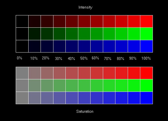
The lower group contains rows that go from zero saturation (pure gray) to fully saturated colors. It is most useful to check color purity in the presence of other colors. Even the 10% squares should be clearly recognizable as being reddish, greenish and bluish. In many monitors these pastel colors blend over into wrong tones! It's not uncommon to see a square that should be a little red go a little violet instead! This test is very sensitive to proper color bias adjustment.
Just like in all other tests, each square should be clearly different from all others in that raw. A monitor which can't show the dark colors will show the 90% and maybe 80% saturated colors as being 100% saturated, since the small components of other colors in them fall below the monitor's threshold.
So, I hope that your monitor is not too bad! :-) Anyway, since gamma is almost always way off, and many monitors cannot display the darkest colors, the photos throughout my website have been corrected for a higher gamma. But since monitors are so different, unfortunately I cannot guarantee that the photos will look right on every screen. Try to adjust yours to get the best results. This adjustment can well be different for the pages in the photo section having dark gray background, and all the other pages with yellow background.